


G@MeF@Ce
 | ||

^,^


 5163
5163 1247
1247 2009-10-09
 1974-05-28
 50
50 8363
8363
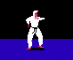
Fire Knight


If you have been with us through the years...
then you have seen many versions of the "Game-Face-Logo" In response to positive feedback and constructive criticism it has continued to evolve. One bit of advice I always hear from my graphical friends is to keep it simple and more streamline.
(I still can't figure out why "keeping it simple" has always been a challenge for me?
So after whittling away for quite some time (years) I was finally able to use less pixels to create the shapes and symbols that really represents what G101 the website is all about +
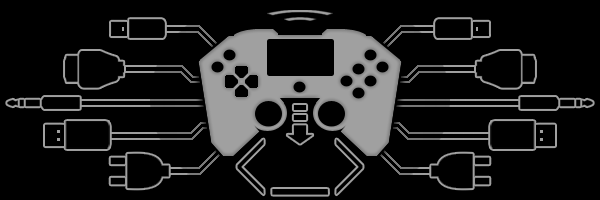
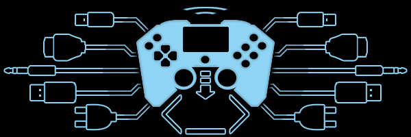
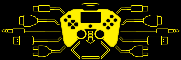
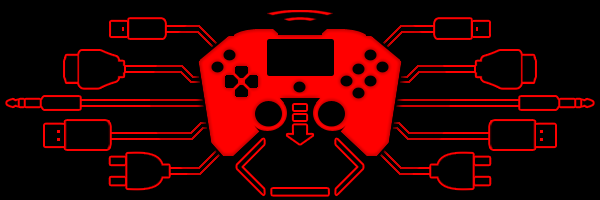
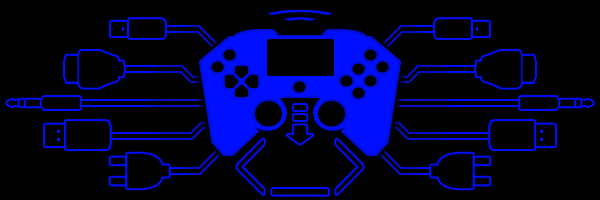
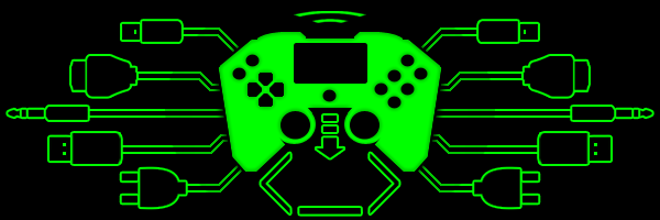
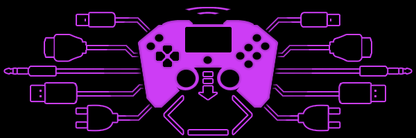
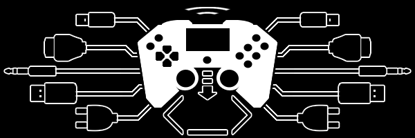
The controller: represents a cross between the Xbox1, PS4, with the touch screen like the Wii U tablet in the center as if you could also play games without the TV/Monitor, select start buttons in the top left and the gotta have 6 buttons for games like street fighter + (I hope to make this controller real 1 day)
The face: consists of code tags < scripting/programming > and the down arrow ↓ nose shows devotion towards coding.
The wires: once were circuits, now have stereo for sound, hdmi for video, micro usb and usb, and power as in connected to all.
creative gaming:
red - graphics
yellow - story
blue - sounds
green - programming
purple - projects
The new design is simple and each shape and symbol serves a relevant purpose the the cause. This is why it has been approved as the final, sure there will be other versions in the future no doubt, but this one is here to stay so hopefully it's just as eye-catchy and easy to get used to.
signature
Administrator


 Nice, looks like your face (brain) is plugged into what ever floats its way. The different connections show all the culture flowing in and out of a persons head. The screen on the controller reminds me of the third eye, one for viewing not for seeing.